[Case study]
Traction Ag
Modern polish, dirt still under the nails.

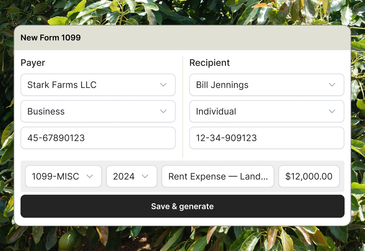
The challenge
Traction Ag builds accounting software for family farms — the kind of company that’ll correct you that it’s “soil, not dirt.” Farmer-owned, built in Indiana, decades deep in the actual work. But the brand read like the generic SaaS they define themselves against, and the site wasn’t converting the farmers who landed on it. They needed to look modern without looking like Silicon Valley — the exact line most rebrands trip over.
What we did
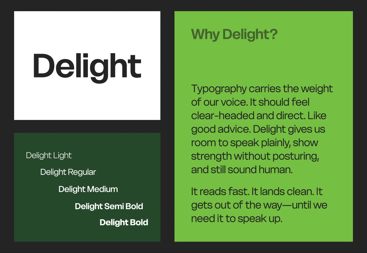
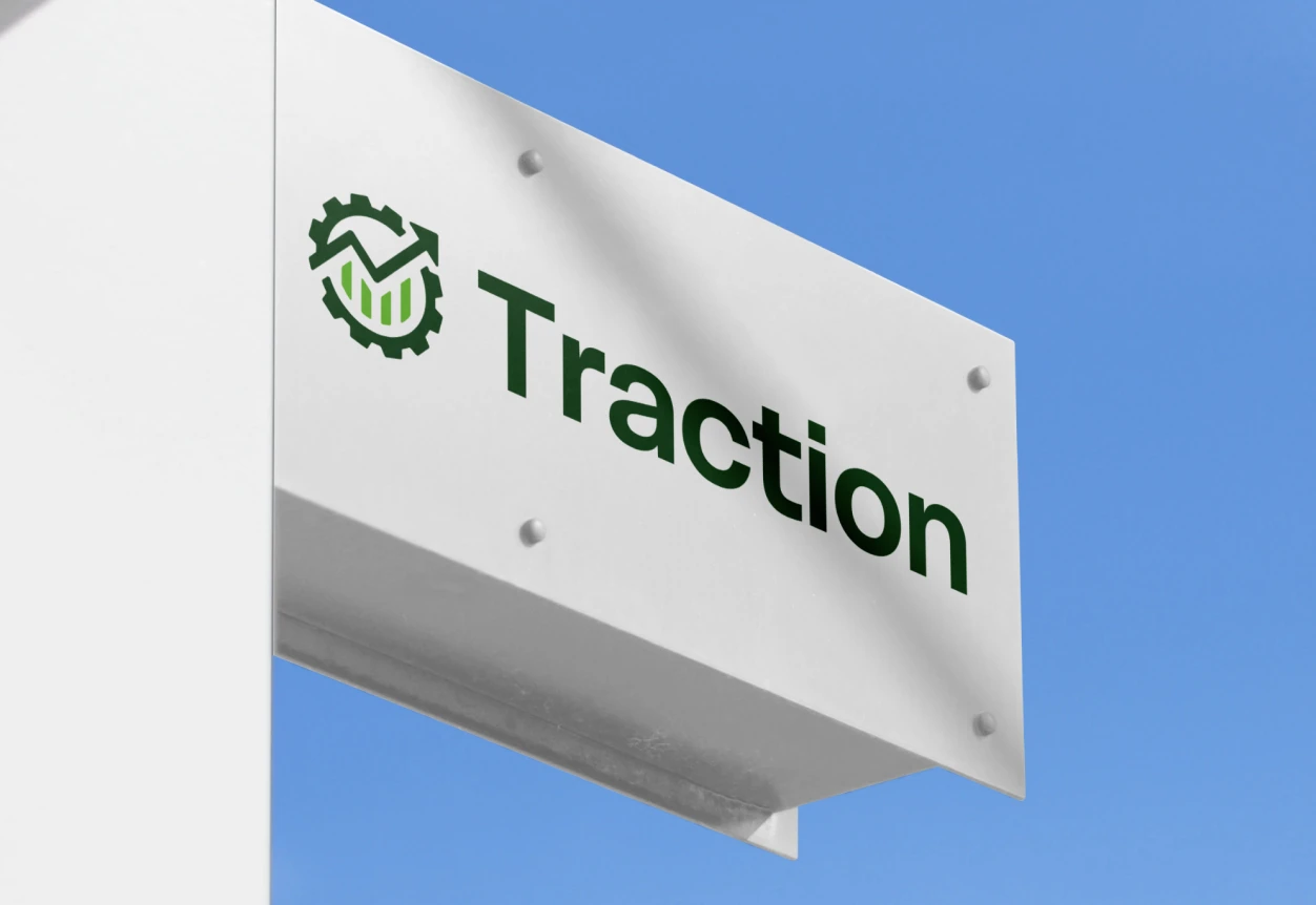
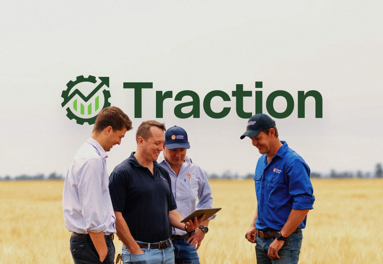
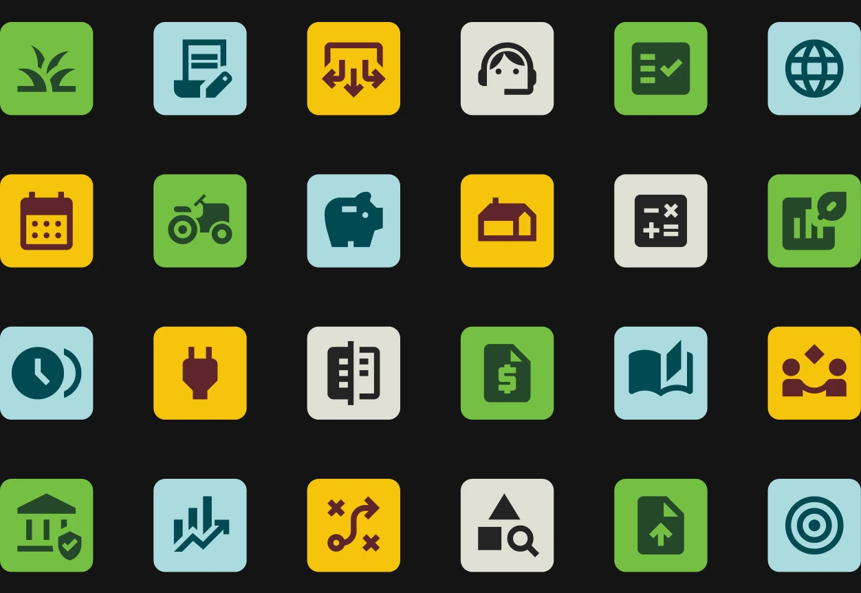
We started with the brand. A new identity top to bottom, built to feel sharp and current while keeping the plainspoken, farm-first honesty that makes Traction Traction. Polish without pretense — the dirt stays under the nails.
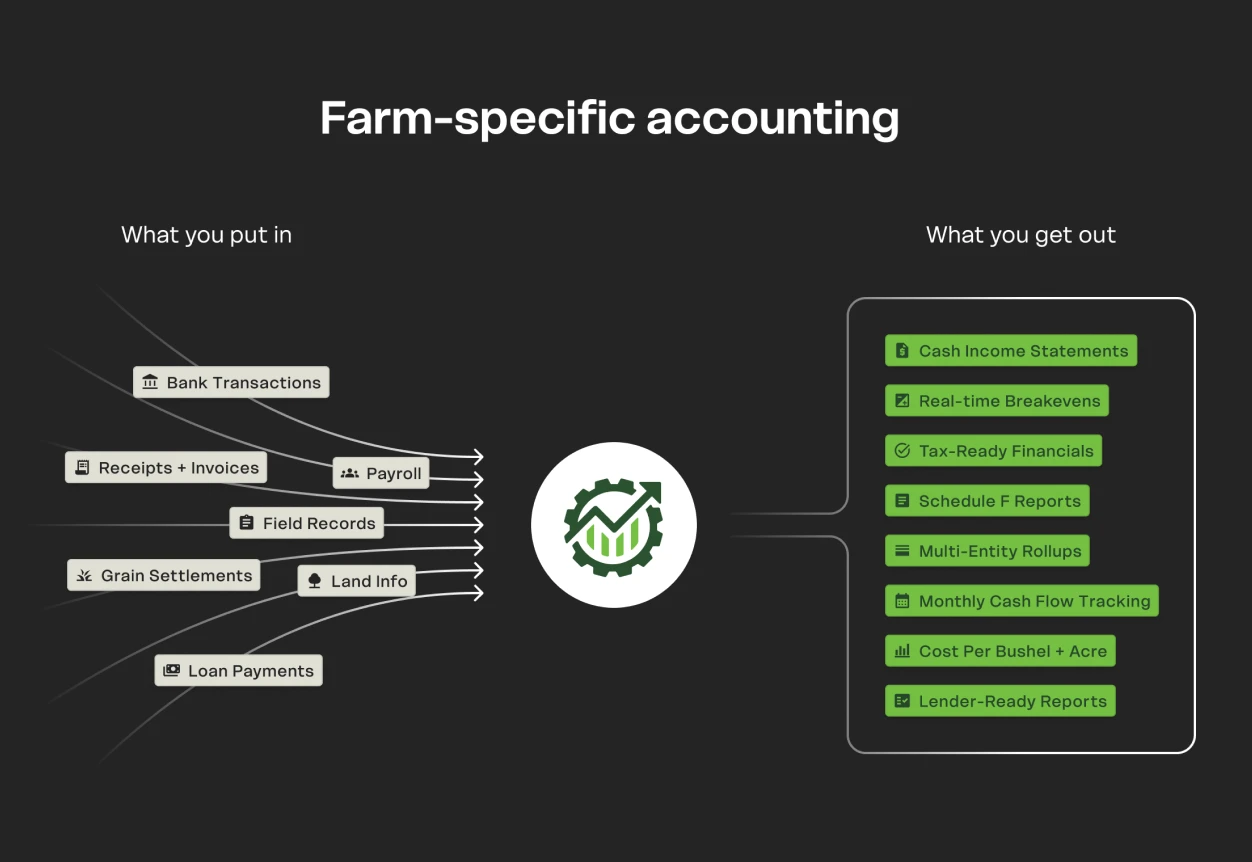
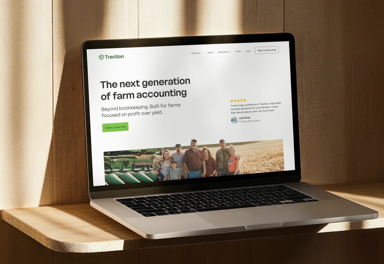
Then the site. A full redesign, built in Webflow: 40+ pages, with CMS collections powering their blog and resource library so their team could publish without touching code. We wrote and structured the whole thing to turn browsing farmers into booked demos.
That launch turned into a partnership. For the past year we’ve run as their embedded marketing team — social graphics, one-pagers, slide decks, campaign design — the full kit, on tap. Next up: onboarding UX work to make the product itself as clear as the brand we built around it.
The results
- 2× demo requests within a month of launch
- 40+ page Webflow site the team publishes to without code
- A one-off launch that became a year-plus marketing retainer
The headline number: demo requests doubled within a month of the new site going live. But the real result is a farm brand that finally looks as capable as the software behind it — and a client who kept us on the roster all season.