[Case study]
RemedyOne
A brand as rigorous as the software they ship.
The challenge
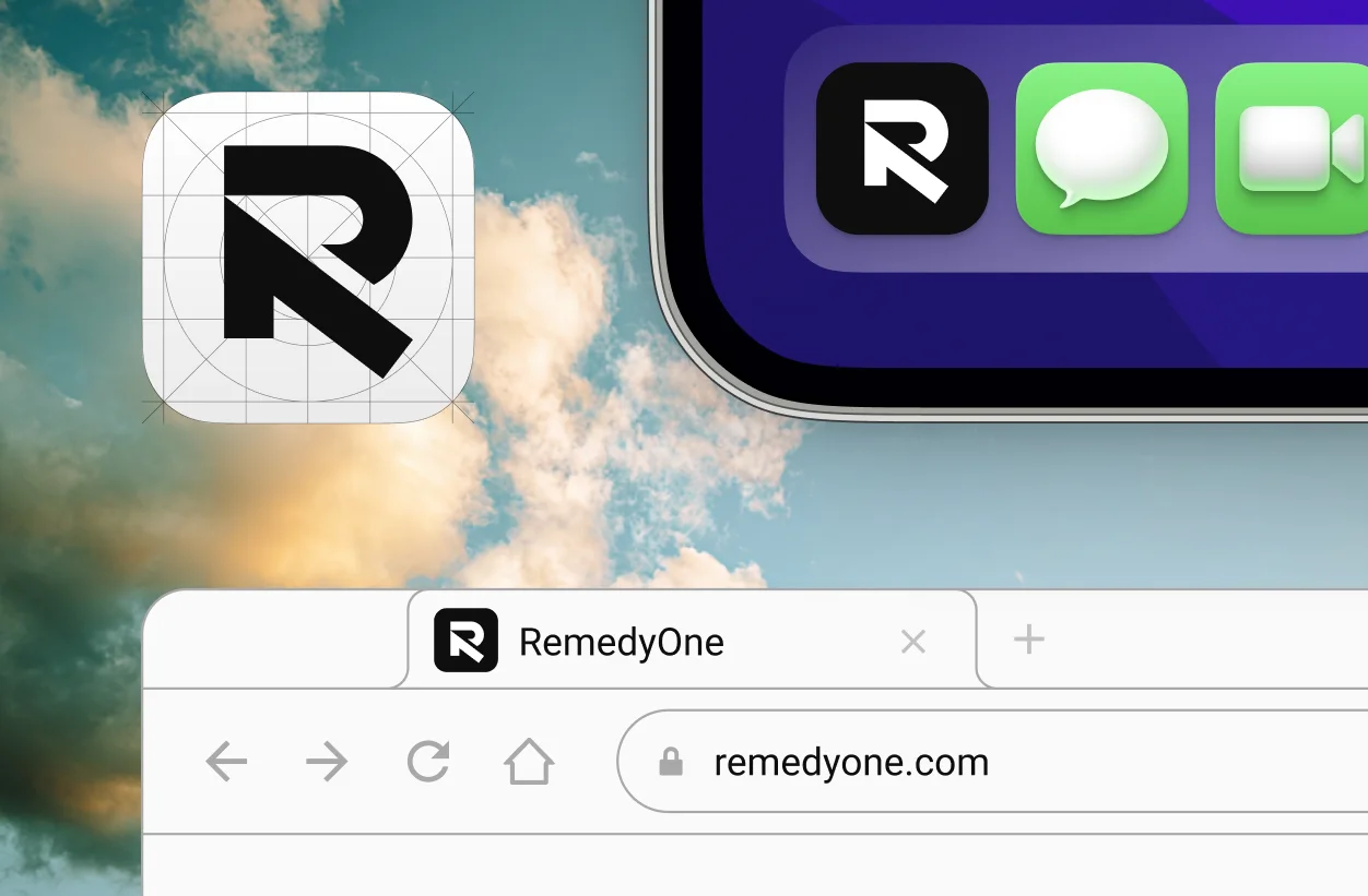
RemedyOne builds compliant, secure software for some of the largest companies in the world. In their world, trust is the whole product — a missed control or a sloppy handoff isn’t a bug, it’s a breach. But their brand didn’t carry any of that weight. The code showed up in a suit; the brand showed up in a wrinkled t-shirt. The offering had matured, and the identity never caught up.
What we did
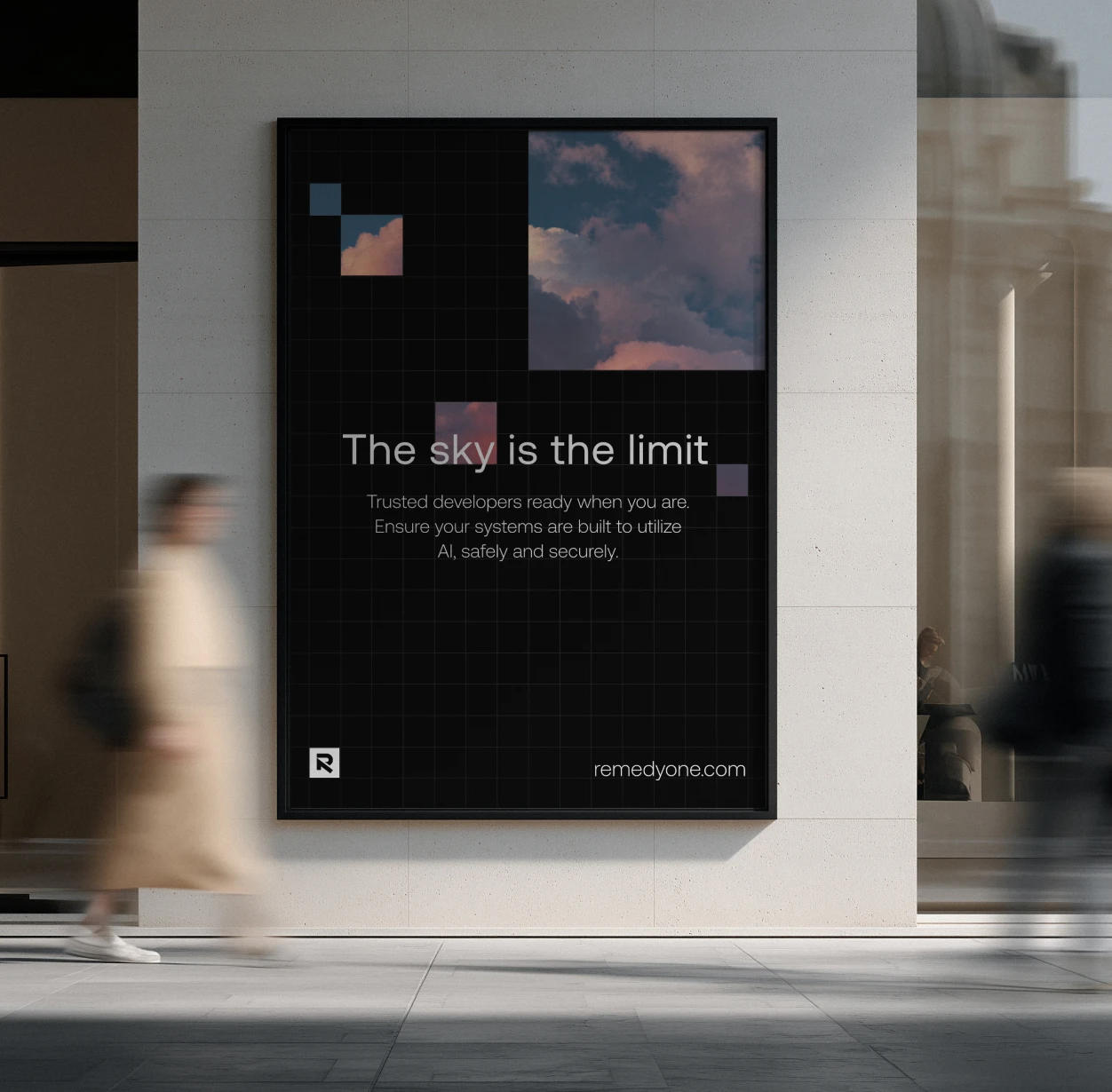
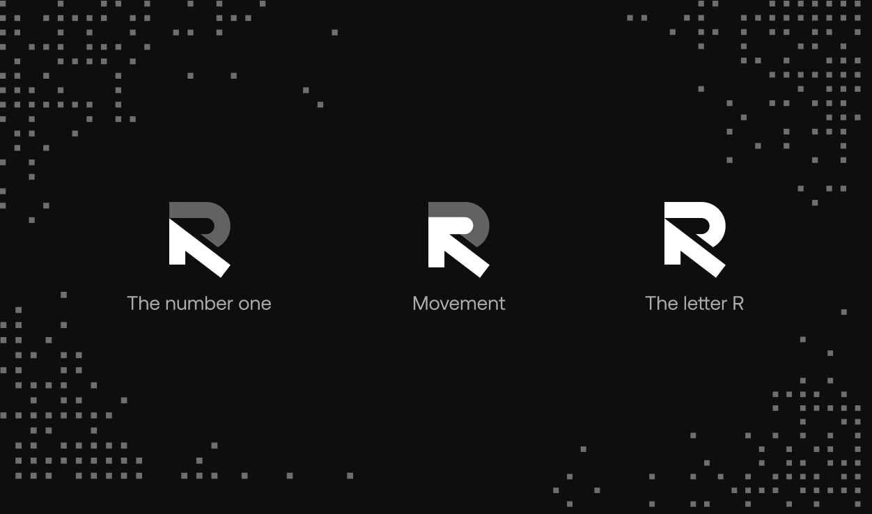
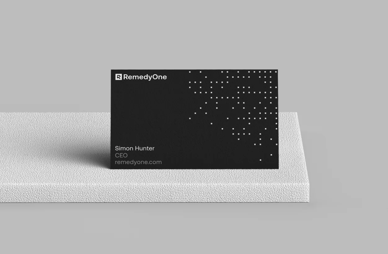
We opened with a workshop to pin down positioning and the story they’d been struggling to tell — who they’re for, why they win, what they sound like. From there we built the full system: logo suite, color, typography, imagery, and a pattern language, all documented in a brand book with clear dos and don’ts so it holds up long after us.
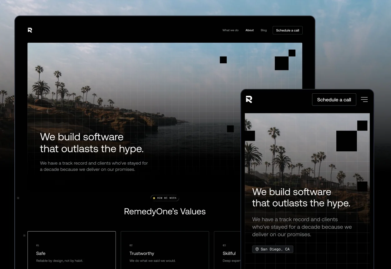
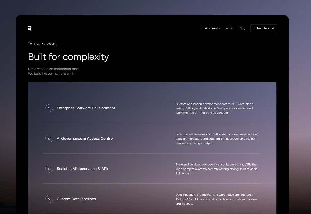
Then the site. We designed 10+ pages across every breakpoint, wrote the copy, and layered in custom illustration and motion to make dense, technical material actually feel alive. Every file was annotated and handed off build-ready for their dev team.
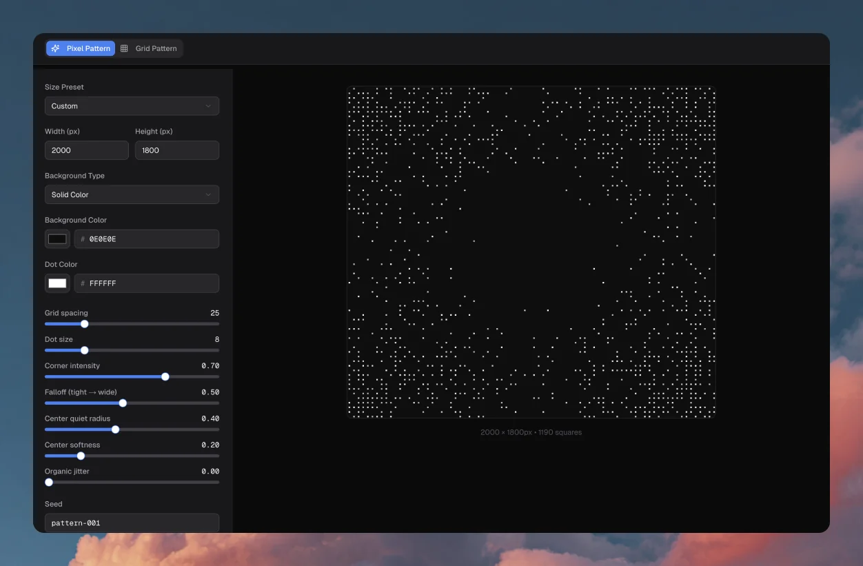
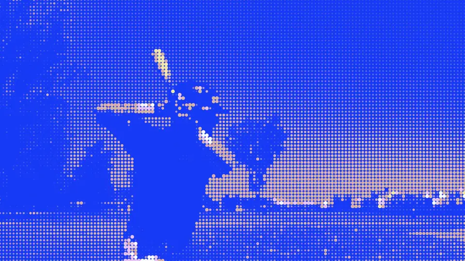
The piece we’re proudest of: an AI pattern generator built on their new visual language. Instead of a static kit that slowly goes stale, RemedyOne can spin up on-brand social and blog imagery on demand — a brand that keeps producing without a designer in the loop. Give a team a logo and you’ve dressed them for a day; give them a system that generates itself and they’re set for the season.

The results
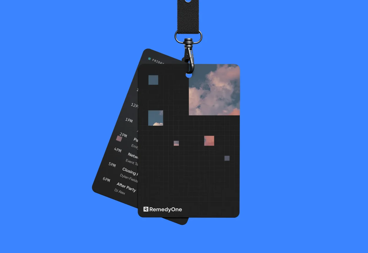
- A full brand system, documented in a brand book built to outlast us
- 10+ page website with copy, custom illustration, and motion
- An AI pattern generator that makes on-brand imagery on demand
The build wraps shortly, but the identity already does what it needed to: it finally matches the rigor of the thing they’ve built.